About the Project
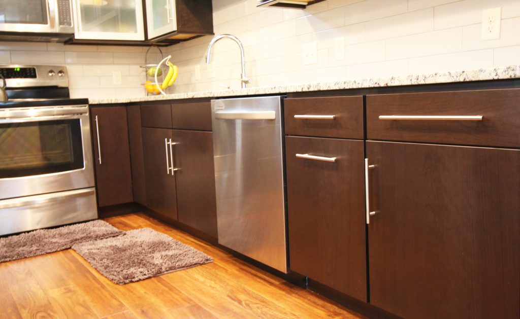
This Mid-century modern home was remodeled to take full advantage of its unique architecture and style instead of hiding it like the existing kitchen was doing. The existing kitchen was tucked back into the darkest part of the space and cut off by the lower window forcing the dining area awkwardly into the other corner. To remedy this we swapped the location of the dining area and the kitchen. This allows the dining area to take full advantage of the windows, and the kitchen to get the most storage for this family by utilizing the uninterrupted walls. The triangular windows were highlighted by bringing the cabinetry flush with the windows and lengthening the cabinetry on the cathedral wall. The refridgerator was positioned closest to the dining area to be out of direct sight of the front door, which is opposite the pantry system. A fun mix of dark wood and stainless steel doors with obscure glass lend to the mid-century style while still incorporating the owners’ aesthetic.


